
Week 1 of Loss Ratio | The Default View
- Rika Taute
- Mar 13
- 3 min read

How underwriting performance is typically presented
The Decision Question
Is the portfolio performing in line with the priced expectation, and is the signal credible enough to act on?
Underwriting committees usually want to know:
Are we above or below target?
Is it material enough to matter?
Is the signal reliable or noise?
Default Practice
The most common chart (shown per product / line):
Single line of ultimate loss ratio over time vs a target or benchmark.

Why this works:
Simple
Familiar
Easy to read quickly
What it communicates well:
Direction of performance
Distance from pricing target
Where the default can be improved
The default chart hides two pieces of information that are critical for decision-making:
Materiality | Credibility |
A 110% loss ratio could represent:
The chart does not tell us. | Extreme loss ratios often occur in small premium years.
Without exposure information, committees can easily overreact to noise. |
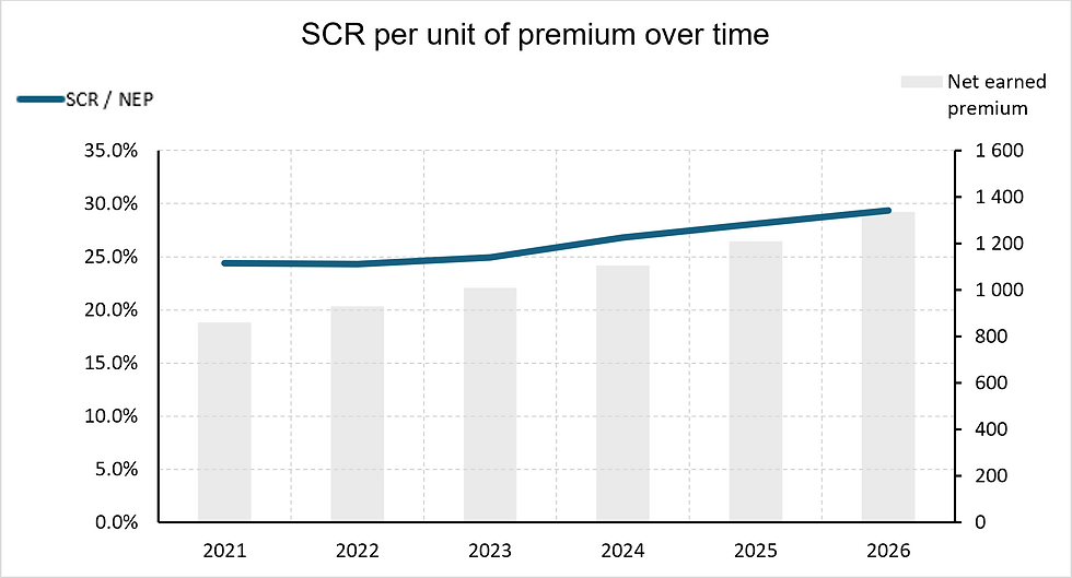
Suggested Improvement: Add premium or exposure
A loss ratio without exposure is only half the story. Enhance the chart by including premium volume.
This can be done in the same chart:

On separate y-axis but using same x-axis, aided by vertical grids:

What becomes visible:
whether the deterioration is large enough to matter
whether volatility is structural or exposure-driven
Second Upgrade - Show the Loss Ratio Components
The latest loss ratio often attracts the most attention.
But for recent years, much of that number is still an estimate.
Instead of showing a single ultimate loss ratio per year, break it into:
Paid loss ratio
Outstanding case reserve ratio
IBNR ratio
So the chart becomes a stacked view of the ultimate estimate.

What This Immediately Reveals:
Estimate dependence | For mature years: Most of the loss ratio is paid. For recent years: A large share is IBNR. That visually shows how much of the number is actual experience vs actuarial estimate. |
Reserve structure | You can see differences such as:
|
Emerging deterioration | Sometimes deterioration appears because:
This chart helps the committee understand which one. |
It answers the unspoken question: “How much of this number is real and how much is estimated?”
Trade-offs:
Slightly more complex to read | The chart introduces three components instead of one. It thus works best when the audience is used to actuarial terminology. |
Interpretation shifts
| The chart is no longer purely about performance vs target. It also becomes a chart about reserve composition. That’s not a flaw, but it changes the focus slightly. |
Gross vs Net | Practical Guidance
Practical Recommendation for pricing discussions: Primary view → gross loss ratio
Pricing decisions should usually start with the gross view, because it reflects the underlying underwriting performance.
Net view can be used as context, but it should not hide the underlying signal.
Gross Loss Ratio | Net Loss Ratio |
Shows underlying underwriting performance. | Reflects reinsurance structure and retention levels. |
Useful for:
| Useful for:
|
Decision Boundary
Use the standard loss ratio chart when: |
|
Use the enhanced version (with exposure) when: |
|
Show the Loss Ratio Components: |
|
Once we can see that performance is changing, the next question quickly follows:
What is driving the change?
In the next edition, we look at ways to visualise the drivers behind movements in loss ratios.


Comments