
Edition 2: Development Patterns - Beyond the Curve
- Rika Taute
- Jan 30
- 4 min read


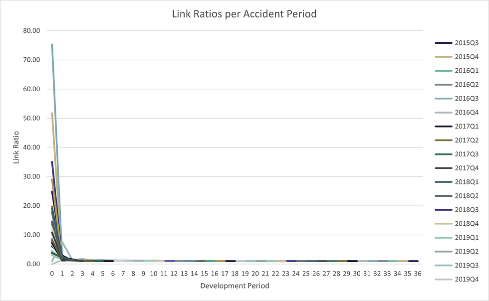
Link Ratios and Development Patterns
In the previous edition, development visuals were treated as decisions rather than defaults. Once that discipline is in place, it becomes possible to look at development patterns in a different way — not to replace standard charts, but to complement them when the question demands it.
This edition explores alternative views that surface variability, structure, and influence more directly. These are not general-purpose charts, nor are they intended for every audience. They are exploratory lenses, useful when understanding stability, spread, or contribution matters more than continuity. The purpose of these visuals is not to improve estimation accuracy, but to improve diagnostic awareness of variability, stability, and influence.
We will begin with the familiar line chart, then progressively loosen its assumptions — first by collapsing time into distributions, and finally by abandoning linear structure altogether.
The data used are for a general insurance book showing significant development in the first 2 periods and then tapers down to link ratios close to 1. Lets now see how we can show it differently.
Link Ratios as Distributions (Box Plot Variation)
Once we accept that development patterns can be stable and still misleading, distributional views become useful.
Link ratios are often shown as lines, but they are not lines — they are distributions observed repeatedly across origin periods.
The box plot reframes the familiar link ratio chart by collapsing time into a distribution for each development period. Instead of asking “what is the selected factor?”, it asks:
“How stable is this development factor, really?”
Box plots introduce:
spread and compression
skewness and asymmetry
outliers and extreme observations
a visual sense of stability versus volatility across periods
This view is particularly useful when a smooth development curve masks meaningful variation, or when confidence in a selected factor depends on more than its central tendency.
I used the standard excel “Box and Whisker” chart with a line graph overlay.
In the chats following below, each vertical box summarises the distribution of link ratios observed for a single development period across all origin periods.
For each development period:
The box spans the interquartile range (IQR)
– the middle 50% of observed link ratios
– bounded by the 25 th and 75th percentiles
The horizontal line inside the box marks the median link ratio
– the central observed value, not a selected factor
The whiskers extend to the most extreme values that are not considered outliers
– typically up to 1.5 × the interquartile range (25th to 75th) beyond the quartiles
Individual points beyond the whiskers represent outliers
– development observations that differ materially from the bulk of experience
Plotted alongside the boxes, the line overlay shows the selected link ratio.
The first chart include all development periods and the 2nd exclude the first development period so we can observe the rest more granularly.


Radial Dot Plot — Structure and Contribution
The radial dot plot introduces a novel alternative as exploratory visual. It does what the typical link ratio line chart does but trades precision for pattern recognition.
I propose using it as an engaging visual for your more flashy reports, not as a default.
The development periods are shown on the circular axis, and the accident periods are shown in the colour of the dots. The first period at 12 0’clock has the biggest variance with the rest quickly converging to 1 (no further development) in period 14 to 15.

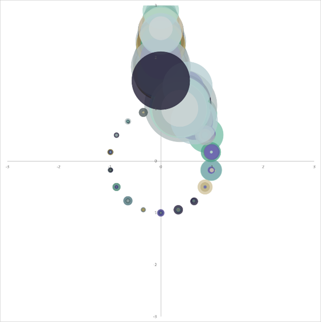
The small insert on the left shows a version where the absolute value of claims have been used to size the dots. While size-encoding claim magnitude may appear informative, in practice it introduces visual dominance effects that obscure development structure.
An improvement would be to highlight in colour the most relevant accident periods and grey the less relevant / background information.
Radial Dot Plot — When to Use, and When Not To
The radial dot plot is an exploratory visual. It is designed to reveal structure and contribution rather than to support precise reading or formal selection. While it uses the same underlying link ratio data as a standard development line chart, it changes the visual priorities — and in doing so, changes the kinds of questions that can be asked.
This makes it powerful in narrow contexts, and inappropriate in most others.
When This Chart Is Useful
The radial dot plot is most effective when the goal is pattern discovery, not communication of exact values. Because each dot represents an observed development ratio, clustering and spread become visually prominent. Periods with tight, consistent behaviour appear as compact radial groupings, while volatile periods visibly fan out.
Use it when:
You are exploring stability versus dispersion across development periods
You want to show that certain periods consistently behave differently from others
The question is “Where does development structure exist?” rather than “What factor should we select?”
You want to engage your audience and invite exploration.
Why It Does Not Improve on Line Charts for Everyday Use
Loss of Precision
Radial layouts distort distance perception. Small vertical differences that are easy to compare on a Cartesian axis become harder to judge once wrapped around a circle. This makes the chart unsuitable for factor selection and year-on-year comparisons.
Reduced Comparability
Line charts excel at showing continuity across development periods. The radial format breaks this continuity into segments, making it harder to:
track smooth progression
compare adjacent periods numerically
detect small trend changes
Closing
Link ratios are often drawn as lines (or simply used in their original triangle format), but they behave as distributions. Seeing them as such changes the kinds of questions we can ask — about stability, outliers, and which periods truly drive development. Visuals like box plots and radial dot charts do not add certainty, but they do add context.
Used selectively, these views expand what can be seen without abandoning actuarial rigour.
Scope and Use of Visuals
The visuals presented in this edition are intended as exploratory diagnostic tools to support understanding of development behaviour, variability, and structure. They do not replace standard reserving analyses, do not determine selected development factors, and should not be relied upon in isolation for estimation or decision-making. Where non-standard visual forms are used, they are included to prompt qualitative assessment rather than precise comparison, and their limitations are explicitly acknowledged. Any actuarial conclusions remain grounded in established methods and professional judgment, with these visuals serving only as supplementary context.


Comments